How to approach colors on interfaces — Understanding grays
This is not exactly a color theory article.
I’ve never been the most creative with my colors and to be honest I’ll admit colors didn’t make sense for the longest time. Even though I went to design school, I’ve always felt more comfortable in my coding abilities rather than in my artistic ones. So, over the years, after creating many color pallets for my UIs, I’ve developed a more practical approach for deciding colors and that’s what I’ll try to share in this series of articles.
- Understanding Grays (this one)
- Understanding Saturation and Brightness — coming soon
- Understanding Hue — coming soon
- Understanding Color Systems — coming soon
Unsaturated grays are boring, even though they’re still okay
I remember when I used to do oil painting, every book and tutorial told me not to use pure white on my canvas, and there’s a reason behind that. Even though we might perceive color as a pure color on our brains, there’s always some touch of saturation in that.
That is related to the polemic Pink and White vs Gray and Teal Vans sneakers. The original shoe color is pink and white, but the white on the photo has a cool tone, which in comparison to the pink base totally changes the perception of the color.
We don’t feel color separately, we always perceive color in relation to others. That all to say that when creating your gray shades to UI you might feel tempted to go on the easy path and simply choosing different brightness for each color.
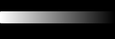
No saturation grayscale
I mean, this is okay, it’s not like the end of the world. But if you ever tried to remove the saturation of a “white” background you’ll know how unsaturated gray can feel weird with something colored in front of it.
Take this example, using an unsaturated gray on a green background might feel weird, but when we give the color just a little bit of saturation it makes the design look a lot nicer to the eyes.
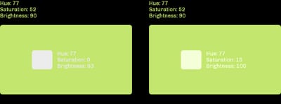
Choosing the correct hue/temperature
So my practical tip here is to understand where your brand colors float and then decide how you’ll approach your gray shades.
Usually, a good tip is to take your main brand color temperature and go the opposite direction with your grays, just like in the examples from Hubspot and Biings design systems below.
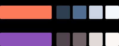
Demonstration of warm brand color with a cool grayscale and vice-versa
Believe it or not, there’s a whole bunch of possibilities when toning your scale. In the last project that I’ve worked on, the brand had a very present gradient from a purple-ish blue to orange, when applying this gradient to the buttons on the interface the orange clearly stood out. So, I’ve decided to give my gray purple to complement my UI highlights giving the whole interface background a cool tone that makes the hotter colors of my primary actions pop up. And you can go the opposite way too, if you have a more prominent cool color, you might want to have more hot gray shades.
Be careful!
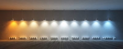
The safest colors to go with your grayscale are obviously blue and orange because they’re the most similar to the lights we see in our lives. But you can go crazy depending on your project. In my case, I’ve already worked my scales with purple, and you can also try green, pink, teal, or whatever, I would only recommend testing to see if this kind of hue goes with your use case.
A case for subjectiveness and skeuomorphism
There is also another completely subjective aspect to your grayscale that has to do with skeuomorphism.
This is totally a preference of mine, but I tend to go with warm pallets when the product has a more classical mood or even mimics something real (for example Notion grays are a little bit warm, almost resembling a notepad you might have with sepia pages). On the other hand, more modern digital products without a direct analogic analogous tend to go with cooler pallets, our screens emit a blue light so it makes sense that these kinds of interfaces behave similarly.

Again, not a rule, but it’s a good start.
In the next article, I’ll talk about how to create your grayscale pallete in practice and how saturation behaves in different brightnesses.